PowerPoint is so easy to use that we often believe that with a little bit of experience, we are good at it. Studies show that more than 80% of presentations are poorly done. You do not need to be a researcher though, to know that most presentations using PowerPoint are sleepers. Too often, shows are full of badly designed slides that contain too much detail and provide the audience with too little of what they really want – what it all means.
Take a look at the two slides below created by Marianne Gates.


Right off the bat – which has more eye-appeal? What is your initial reaction to each of the slides?
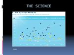
The objective of the slide is to demonstrate that taking a particular supplement lowers the oxidative stress level regardless of your age.
Which slide is more effective at reaching that objective?
Which are you more likely to remember?
Marianne realized the first slide contained more information than was needed. It is complex and overwhelming: audience members would not even try to understand it. Her success rate with her presentation overall was lower than she desired.
Notice the changes she made on the after slide:
- The graphics are clear and crisp.
- The message is easily readable.
- It contains only the information essential to her point.
- Extraneous information has been eliminated.
- The trend is clearly apparent.
- She reinforces her point with color (red is bad and green is good).
- She uses her words to give the context limiting the amount of information needed on the slide.
- (What you can not see here is the animation she uses. The slide opens with just the axis. As she talks, the red and green lines appear).
She has not cheated her audience by removing information; she has enhanced their ability to understand what she is saying.
Your graphics should be designed to help you get your message across as simply and easily as possible.
Marianne did not just “re-create” her slides. She went through a process of determining her message, laid out measurable objectives, and then created her visual aids. This was not an easy 15-minute fix. She invested money in training and many hours of time into improving her presentation. Her investment will pay off, as she will more easily and quickly reach her goals. She will save time and earn more money. She already feels more confident in her presentation, which will make her a more credible speaker.
Congratulations Marianne.
If you are interested in receiving a copy of “Tips For Effective PowerPoint Graphics”, send an email to ethan@iSpeakEASY.net with “PowerPoint Tips” in the subject line.
All rights reserved. This copyrighted material may not be re-published without permission. Links are encouraged.

Is it okay to leave data out of my presentation? I feel as if I am cheating my audience or that they will think I am a fraud. I am a scientist and I present my studies to other scientists. Is it really okay to trim things down like this?
Mary:
Thanks for the question and the answer is an overwhelming YES.
Scientists (and other audiences) want to know what your information means. They are less concerned with knowing all the data points and the quirks of your research. If you provoke them enough, they will ask to see your data, inquire about your survey methods etc, – give it to them at that point.
In the mid 1990s Hewlett Packard did a study to see what technical audiences want from a technical presentation. The results showed that rather than wanting a “data dump” technical audiences wanted to know what the data meant, better presentation skills, and more effective graphics.
I am direct you to this study if you would like.
The example in the article above is a good example. The trend is clear while the confusing data points are left out. The complete data is available if anyone wants to see it.
Keep it simple and clear.
Thanks Mary.
I agree. A presentation is a performance.
They’ll forget what you said but they’ll never forget how you made them feel.
If you confuse an audience with complicated detail then confusion will be what they remember -not the detail.
[…] via Magical Transformations – Creating Effective Power Point Graphics « Ethan Rotman’s iSpeakEA…. […]